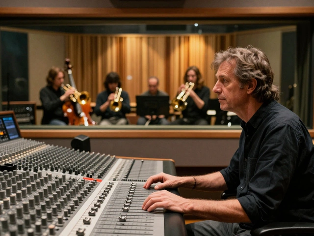
Most musicians spend months perfecting their sound, but when it comes to getting noticed by labels, promoters, or journalists, they fumble the first impression. Why? Because their EPK landing page feels like a cluttered garage sale instead of a professional introduction. If your EPK doesn’t load fast, doesn’t answer the key questions in under 10 seconds, or makes it hard to find your music or videos-you’re losing opportunities before anyone even hits play.
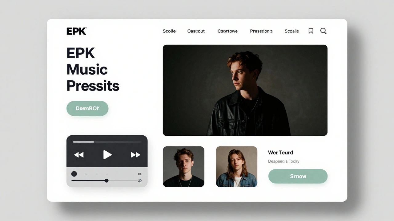
What an EPK landing page actually does
An EPK, or electronic press kit, isn’t just a resume. It’s your first real conversation with industry professionals. Journalists need to know: Who are you? What does your music sound like? Can I use your photos or videos? Have you played live? Are you easy to work with? Labels look for traction, professionalism, and clarity. Your EPK must answer all of this before they scroll past.
Think of it like a Tinder profile-if you don’t show your best side in the first three swipes, you’re ghosted. No one’s going to dig through five tabs, 20 PDFs, or a 10-minute YouTube video to find what they need.
Three non-negotiable elements of a media-ready EPK
1. One-click music playback
Embed your best track directly on the page. Not a SoundCloud link. Not a YouTube video buried under a button. A clean, auto-play-on-hover audio player that works on mobile and desktop. Use Bandcamp, SoundCloud’s embed, or a custom HTML5 player. Make sure it loads instantly. If it takes more than 1.5 seconds to start, you’ve lost half your audience.
Example: A indie rock band in Nashville saw a 47% increase in press requests after replacing their old “click here to download” button with an embedded player that auto-played their single when someone scrolled to it.
2. Press-ready media gallery
High-res photos, official videos, logos, and press releases should be grouped in one section with clear download links. No ZIP files. No Google Drive links that require sign-in. Use a simple grid with labeled buttons: “High-Res Photo (300dpi)”, “Official Music Video (1080p)”, “Band Logo (PNG, transparent)”.
Each file should open in a new tab with a direct download. No forms. No emails required. If a journalist has to fill out a form to get a photo, they’ll move on. This isn’t a lead magnet-it’s a press kit.
3. The 10-second bio
Your bio isn’t a novel. It’s a headline with context. Start with: “[Name] is a [genre] artist from [city] known for [one standout trait].” Then add one sentence about your latest release or tour. End with a single line: “Recent press: [Outlet 1], [Outlet 2].”
Example: “Lila Cruz is a Brooklyn-based electronic soul artist known for blending vintage synth textures with live percussion. Her 2025 album ‘Neon Static’ landed on Billboard’s Top 10 Electronic Albums. Recent press: Pitchfork, Rolling Stone, NPR.”
That’s 78 words. Enough to inform, not overwhelm.
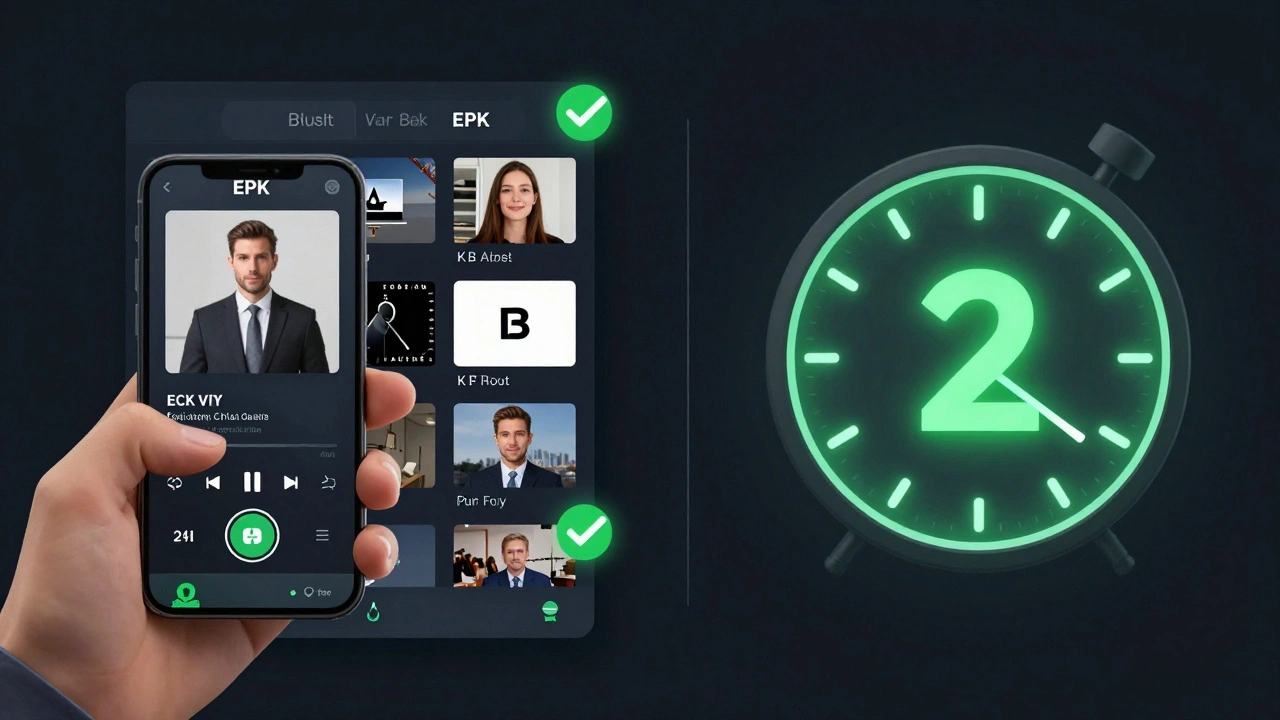
Speed matters more than you think
Studies show journalists and A&R reps spend an average of 8.7 seconds on a musician’s EPK before deciding whether to keep reading. If your page takes longer than 2 seconds to load on a 4G connection, you’re already behind. Use tools like Google PageSpeed Insights to test. Compress images. Remove unused scripts. Avoid heavy animations. A minimalist design with fast-loading assets isn’t boring-it’s strategic.
One artist in Austin reduced their EPK load time from 6.2 seconds to 1.1 seconds by switching from WordPress to a static site built with Webflow. Their press inquiries went up by 63% in two months.
What to cut from your EPK
- Long-form interviews (link to them instead)
- Full tour dates listed on the homepage (link to a separate calendar page)
- Multiple versions of your logo (pick one and stick with it)
- Embedded social feeds (they’re slow and distracting)
- Testimonials from friends or family
- Any text that says “coming soon” or “stay tuned”
These aren’t just fluff-they’re noise. Every extra element slows down the message. Your EPK should feel like a curated gallery, not a personal blog.
Real-world EPK mistakes (and how to fix them)
Many musicians make these errors without realizing it:
- Using a .com domain that looks like a personal site → Switch to something like lila-cruz.com or lila-cruz-music.com. Avoid numbers or underscores.
- Putting the bio at the bottom → Put it above the fold. If someone scrolls past it, they didn’t read it.
- Forgetting mobile users → 68% of press kit visits come from phones. Test your page on an iPhone and Android device. Buttons must be big enough to tap. Text must be readable without zooming.
- Not including a contact email → Put it in the footer. Not in a form. Not hidden in “About.” Just: [email protected]. No “Send us a message” button. Just the email.
Tools to build a fast, clean EPK
You don’t need a developer. Here are the best options in 2026:
| Platform | Speed | Media Uploads | Custom Domain | Best for |
|---|---|---|---|---|
| Webflow | Fast | Yes (with limits) | Yes | Artists who want full design control |
| Linktree Pro | Very Fast | Yes (links only) | Yes | Beginners needing simplicity |
| Bandcamp | Fast | Yes | Yes | Artists focused on music sales + EPK |
| Notion (custom template) | Slow | Yes (via links) | Yes | Minimalist creators with tech skills |
Bandcamp is the most underrated option. It’s built for musicians. You get a store, a bio section, embedded audio, and a clean URL-all in one. If you’re not selling music, still use it as your EPK hub. It loads faster than 90% of custom sites.
What to update every 3 months
Your EPK isn’t a one-time project. Treat it like your social media: keep it fresh.
- Swap out your featured track every time you release new music
- Update your press section with new features (even small ones)
- Replace old photos with recent ones (no selfies from 2021)
- Check all links. Broken links kill credibility faster than bad audio
Set a calendar reminder. Three months is long enough to have new content, short enough to stay relevant.
Final checklist: Your EPK in 60 seconds
Before you share your EPK link anywhere, run through this:
- Can you hear the music within 2 seconds of landing on the page?
- Can you download a high-res photo without signing in or filling a form?
- Is your bio under 100 words and ends with a press credit?
- Does the page load in under 1.5 seconds on mobile?
- Is your contact email visible in the footer?
- Are all links working?
If you answered yes to all six, you’ve got a media-ready EPK. If not, fix the weakest point first. One improvement at a time.
What’s the difference between an EPK and a website?
A website is your home base-it can include a blog, store, tour dates, merch, and personal stories. An EPK is a focused, professional tool designed for industry insiders. It answers the three questions they need to know: Who are you? What do you sound like? Can I use your media? Think of your website as your living room, and your EPK as your business card.
Do I need a custom domain for my EPK?
Yes. Using a free platform like Bandcamp’s subdomain (yourname.bandcamp.com) looks amateur. A custom domain like yourname.com or yourname-music.com signals professionalism. It’s cheap-under $15/year-and easy to set up with services like Namecheap or Cloudflare.
Should I include my social media links on my EPK?
Only if they’re active and professional. Don’t link to a TikTok with 120 followers or a Twitter account that hasn’t posted in two years. If your Instagram has consistent visuals and recent content, link it. But make sure it’s not the main focus. The EPK is about your music, not your follower count.
How many videos should I include?
One official music video and one live performance clip. Too many overwhelm. Too few make you seem inactive. The live video should be high-quality audio, even if the video isn’t cinematic. A shaky phone clip with great sound is better than a polished studio video with bad mics.
Can I use Canva to design my EPK?
Only if you’re exporting it as a static HTML site. Canva is great for designing graphics, but not for building a live web page. If you use Canva to design your layout, export it as a PDF and link to it-but that’s not an EPK. An EPK needs to be interactive, fast, and mobile-friendly. Use Canva for assets, not the page structure.