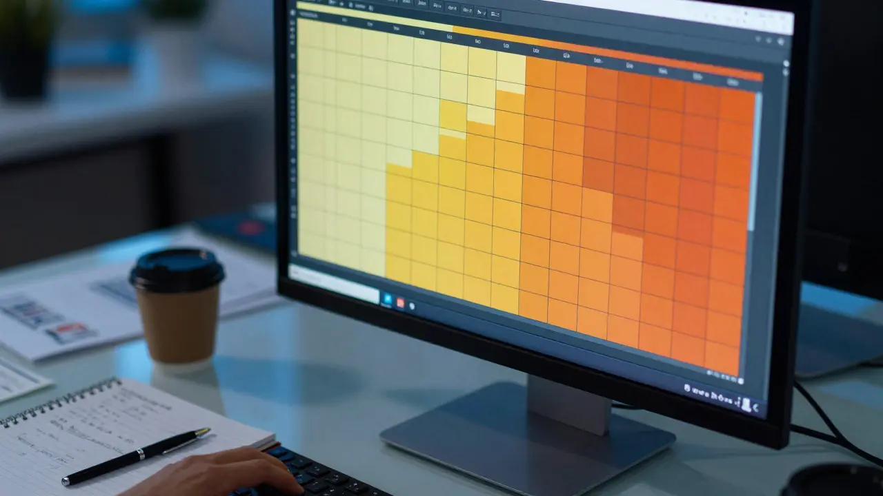
Imagine staring at a spreadsheet with thousands of rows. You know the numbers are there, but finding the pattern feels like hunting for a needle in a haystack. That is exactly where a chart heatmap changes the game. It turns raw data into color-coded blocks that your brain processes instantly. For professionals analyzing sales trends or regional performance, this visual tool is not just a fancy graphic; it is a decision-making engine.
We are looking specifically at how to visualize the strongest markets for a fictional but representative figure, Robert Hill. Why use a persona? Because real-world data often involves sensitive client names or proprietary metrics. By using "Robert Hill" as our case study, we can focus entirely on the mechanics of building an effective heatmap without getting bogged down by specific company jargon. The goal here is simple: show you how to identify which regions, products, or time periods drive the most value, and how to present that information so stakeholders act on it immediately.
Why Heatmaps Beat Traditional Charts
Most people default to bar charts or line graphs when they think about data visualization. And for good reason. A line graph shows trend over time beautifully. A bar chart compares discrete categories effectively. But neither handles two-dimensional density well. If you want to see *when* and *where* performance spikes simultaneously, you need a grid.
A heatmap uses color intensity to represent magnitude. Darker shades usually mean higher values, while lighter shades indicate lower ones. This allows you to scan hundreds of data points in seconds. In the context of Robert Hill’s market performance, we are likely dealing with three variables: Region (X-axis), Month or Quarter (Y-axis), and Revenue or Growth Rate (Color). Traditional charts would require you to mentally cross-reference multiple lines or bars. A heatmap does that work for you visually.
The cognitive load is significantly lower. Your visual cortex is wired to detect patterns in color and space faster than in numerical text. When you see a cluster of dark red squares in the top right corner of your chart, you know immediately that the Northeast region had its best performance in Q4. You don't need to read the exact dollar amount to understand the story. You only look at the specific number if you need precision for a report. This speed of insight is why heatmaps dominate dashboard design in modern business intelligence tools.
Defining the Data Structure for Robert Hill
Before you open any software, you need to clean and structure your data. A common mistake is trying to plot raw transaction logs directly. You need aggregated data. For our example, let's assume Robert Hill manages sales across five major US regions: Northeast, Midwest, South, West, and Pacific Northwest.
Your dataset should look like a flat table with these columns:
- Region: Categorical variable (e.g., "West", "Midwest").
- Time Period: Categorical or ordinal variable (e.g., "Jan 2025", "Q1 2026").
- Metric: Numerical variable representing performance (e.g., "Total Revenue", "Growth Percentage").
Let's say we are tracking monthly revenue for the last 12 months. That gives us a 5x12 grid. Five rows for regions, twelve columns for months. Each cell in that grid will contain one revenue figure. If a region has no sales in a month, that cell is zero. This structure is critical because heatmaps require a matrix format. If your data is scattered across different sheets or formats, spend the time to pivot it first. Tools like Excel Pivot Tables or Python Pandas make this aggregation straightforward.
Choosing the Right Color Scale
This is where most heatmaps fail. People pick colors because they look pretty, not because they communicate accurately. For a business metric like revenue, you generally want a sequential color scale. This means light colors for low values and dark colors for high values.
Avoid diverging scales (like blue-white-red) unless you have a meaningful midpoint, such as profit vs. loss. Since we are looking at "strongest markets," we are assuming all values are positive revenue. Using a diverging scale here would confuse readers, making them wonder if the middle white area represents zero or average.
Here is a practical rule of thumb for color selection:
- Start Light: Use a very pale shade of your primary brand color or a neutral gray for the lowest values.
- End Dark: Use a deep, saturated version of that color for the highest values.
- Test for Contrast: Ensure the difference between adjacent steps is visible. If the jump from step 3 to step 4 is too subtle, you lose the ability to distinguish moderate performance from high performance.
In our Robert Hill example, let's use a gradient from pale yellow to deep orange. Yellow indicates months where revenue was below $50k. Orange indicates months above $100k. This immediate visual cue helps stakeholders spot the "hot spots"-the combinations of region and time that delivered the best results.

Building the Chart Step-by-Step
You don't need expensive enterprise software to create a professional heatmap. Let's walk through creating this in a common tool, assuming you have your pivoted data ready.
Step 1: Import Your Matrix. Open your visualization tool (Excel, Tableau, Power BI, or even a simple HTML/JS library like D3.js if you are coding). Paste your 5x12 grid. Ensure the headers are clear. Row headers should be Regions. Column headers should be Months.
Step 2: Map Values to Color. Select the entire data range. Apply a conditional formatting rule or a color scale. Set the minimum value to your lightest color and the maximum to your darkest. Most tools allow you to set the breaks manually. For instance, you might set breakpoints at the 25th, 50th, and 75th percentiles of your data. This ensures the color distribution reflects the actual spread of your numbers, rather than being skewed by one outlier month.
Step 3: Add Labels and Context. A heatmap without labels is just abstract art. Add a legend that clearly explains what the colors mean. Include the unit of measurement (e.g., "Revenue in USD"). Place the title prominently: "Robert Hill's Regional Revenue Performance: Jan 2025 - Dec 2025."
Step 4: Highlight Key Insights. Once the base chart is built, look for patterns. In our hypothetical data, suppose the West region shows consistently dark orange cells from September to November. This suggests a seasonal peak. You might add a subtle border around those cells or a small annotation arrow pointing to them. Don't clutter the chart, but guide the eye to the most important takeaway.
Interpreting the Patterns: What Does Robert Hill See?
Now that the chart is built, how do we read it? This is where the analysis happens. We aren't just showing data; we are extracting strategy.
Look at the vertical alignment. If a specific month, say January, is dark across *all* regions, you have a global seasonal effect. Maybe it's the start of the fiscal year, or a holiday bonus spending period. This tells you that marketing efforts in December should be geared toward January conversion.
Now look at the horizontal alignment. If the Pacific Northwest row is consistently darker than the Midwest row, regardless of the month, you have a structural advantage in that region. Perhaps the local customer base is more engaged, or the competition is weaker. This insight suggests shifting budget allocation. Instead of treating all regions equally, Robert Hill could invest more heavily in the Pacific Northwest to maximize ROI.
Conversely, if a region is consistently light, it doesn't necessarily mean failure. It might mean untapped potential. If the South region is light but stable, it might be a growth opportunity. If it's light and volatile (flickering between light and medium), it might be a problem area requiring operational fixes. The heatmap reveals the *shape* of the performance, which is crucial for diagnosis.
| Method | Best For | Limitation | Use Case Example |
|---|---|---|---|
| Line Graph | Trends over continuous time | Hides regional differences | Total company revenue growth |
| Bar Chart | Comparing discrete categories | Difficult to show time-series interaction | Top 5 selling products |
| Heatmap | Density and correlation of two categorical variables | Hard to read exact values without tooltips | Regional performance by month |

Common Pitfalls to Avoid
Even with the right data, you can ruin the message with bad design. Here are the traps that catch most beginners off guard.
Too Many Categories. If you try to plot 50 regions against 12 months, the cells become tiny. The human eye struggles to distinguish color differences in small spaces. Stick to a manageable grid size. If you have too many regions, group them into larger zones (e.g., "Northeast US" instead of individual states) until the pattern emerges.
Ignoring Zeroes. If a region has no sales, is that a zero or missing data? Treat them differently. Missing data should be blank or grayed out. Actual zeros should be the lightest color. Confusing these two skews your perception of performance.
Overloading with Text. Don't put the exact number inside every cell unless the grid is very small. It creates visual noise. Use tooltips (in digital dashboards) or a separate data table for precise figures. Keep the visual clean so the pattern remains the star.
Using Rainbow Scales. Avoid rainbow gradients. They imply a circular relationship or a non-linear progression that doesn't exist in linear revenue data. Stick to single-hue sequential scales for clarity.
Next Steps for Implementation
So, how do you apply this to your own work? Start small. Pick one key metric and two dimensions that matter most to your role. Build the matrix. Apply a simple color scale. Look for the darkest and lightest clusters.
Ask yourself three questions after viewing your heatmap:
- Where is the highest concentration of value?
- Are there unexpected gaps or outliers?
- Does the pattern align with my current strategic assumptions?
If the answer to the third question is no, you've found something valuable. The heatmap didn't just show you the past; it challenged your understanding of the market. That is the power of visualizing data correctly. Whether you are analyzing Robert Hill's fictional markets or your own real-world KPIs, the process remains the same: aggregate, visualize, interpret, and act.
What is the best tool for creating a heatmap?
It depends on your technical skill level. For non-coders, Microsoft Excel and Tableau offer drag-and-drop heatmap creation. For developers, D3.js or Plotly provide highly customizable options. Power BI is also excellent for corporate dashboards. Choose the tool that fits your existing workflow.
How many variables can a heatmap display?
Standard heatmaps display three variables: X-axis category, Y-axis category, and Z-value (color). You can technically add a fourth dimension using shape or size of markers within the cells, but this quickly becomes cluttered. Stick to three core dimensions for clarity.
Should I use a logarithmic scale for my heatmap?
Only if your data spans several orders of magnitude. If you have values ranging from $1 to $1,000,000, a linear scale will make the lower values invisible. A log scale compresses the range, allowing you to see patterns in both small and large values. However, for typical revenue or growth rates, a linear scale is usually sufficient and easier for stakeholders to understand.
How do I handle missing data in a heatmap?
Decide if the missing data is truly zero or unknown. If it is unknown, leave the cell blank or use a distinct neutral color like light gray. If it is a true zero, map it to the lowest end of your color scale. Consistency is key; document your choice in the chart footer or legend.
Can I animate a heatmap?
Yes, animated heatmaps are powerful for showing temporal changes. For example, you can animate the months rolling forward to show how regional performance shifts over a year. This is particularly useful in presentations. However, avoid excessive animation in static reports, as it can distract from the data.