Album artwork isn’t just a picture on a Spotify playlist or a CD case. It’s the first thing someone sees before they even press play. It sets the mood, tells a story, and can make the difference between someone scrolling past or stopping to listen. In a world where millions of tracks are uploaded every week, album artwork that stands out doesn’t just help-it survives.
What Makes Album Artwork Memorable?
Most album covers blend into the background. They use gradients, stock photos, or generic fonts. But the ones people remember? They have personality. They feel intentional. Think of Radiohead’s In Rainbows-a simple, hand-drawn envelope. Or Kendrick Lamar’s To Pimp a Butterfly-a surreal, layered scene full of symbolism. These aren’t accidents. They’re strategic choices.
Memorable album art usually has one or more of these traits:
- Strong contrast-dark against light, bold shapes against empty space
- Unusual composition-nothing centered, no obvious focal point
- Handmade elements-sketches, textures, collage, paint
- Emotional tone that matches the music-haunting, chaotic, joyful, cold
- Typography that feels like part of the art, not just a label
There’s no formula, but there are patterns. The best covers don’t try to look professional-they try to look real. Real enough that someone pauses, leans in, and wonders what the music sounds like.
Start With the Music, Not the Software
Too many designers open Photoshop before they’ve even listened to the full album. That’s backwards. Album art should reflect the sound, not just the artist’s Instagram aesthetic.
Ask yourself:
- What emotion does the first track evoke?
- Is the music sparse or dense? Organic or synthetic?
- Are there recurring themes in the lyrics-loneliness, rebellion, hope?
- Does the album feel like a night drive, a crowded room, or an empty forest?
Write down 3 words that describe the album’s vibe. Then, find images, colors, or textures that match those words-not what you think looks cool, but what feels true to the music. A lo-fi bedroom pop album might need faded Polaroids and coffee stains. A heavy metal record might need rusted metal, cracked concrete, or distorted faces.
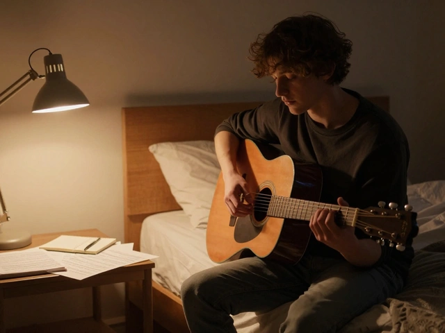
One producer I worked with only listened to the album in complete darkness, with no lights, no phone, just headphones. He said it helped him feel the space between the notes. That space? That’s where the artwork lives.
Color Is a Weapon
Color psychology isn’t just for marketing-it’s critical in music visuals. A wrong palette can make a powerful song feel weak.
Think about how different colors affect perception:
- Deep reds and blacks = intensity, danger, passion
- Neon purples and electric blues = futuristic, synthetic, surreal
- Muted earth tones = organic, nostalgic, grounded
- High-contrast white on black = minimal, urgent, raw
Some of the most iconic covers use just two colors. Nirvana’s Bleach is mostly gray and white. The Weeknd’s Kiss Land uses a single shade of blood red. Limiting your palette forces you to focus on shape, texture, and contrast-things that stick in memory.
Try this: pick one dominant color. Then pick one accent. No more. See if the whole design still works. If it doesn’t, you’re probably overcomplicating it.
Typography That Doesn’t Fight the Art
Text on album covers is often an afterthought. But it’s one of the first things people read. A bad font can ruin even the most stunning image.
Here’s what works:
- Handwritten or custom lettering-feels personal, unique
- Fonts that match the genre-no serif fonts on a punk record, no pixel fonts on a classical album
- Placement that doesn’t block key visual elements
- Opacity and texture that blend into the background, not sit on top of it
Check out the cover of Fleetwood Mac’s Rumours. The name is barely visible, almost hidden in the background. It doesn’t scream-it whispers. That’s confidence.
Don’t use default fonts from your design program unless you’ve twisted them beyond recognition. If it looks like it came from Canva, it won’t stand out.
Test It at Small Sizes
Most people will see your album art as a tiny square on their phone. If it looks good on a 27-inch monitor but turns into a blurry mess at 100x100 pixels, you’ve failed.
Here’s how to test:
- Export your design at 300x300 pixels.
- Resize it down to 100x100 pixels.
- Put it on a white background and a black background.
- View it on your phone in a dark room.
- Ask someone who’s never seen it before: “What does this make you feel?”
If the text is unreadable or the main shape is lost, simplify. Remove details. Increase contrast. Zoom out again. Repeat until it works at every size.
Apple Music, Spotify, YouTube-all of them display artwork in small formats. Your art has to work in that context first. The big version? That’s just bonus.
Break the Rules
The best album covers don’t follow trends. They break them.
Think of:
- Daft Punk’s Random Access Memories-a glowing robot in a desert, no text, no logo
- Frank Ocean’s Channel Orange-a plain orange on a white background
- Yeezus by Kanye West-just a red square with a tiny logo
These covers are bold because they’re simple. They’re quiet in a noisy world. They make you look closer. They challenge the idea that art has to be busy to be good.
Ask yourself: what’s the one thing that would make this cover feel totally different? Maybe it’s removing the artist’s name. Maybe it’s flipping the image upside down. Maybe it’s using only one color. Try it. See how it feels.
Don’t Copy. Steal.
There’s nothing wrong with being inspired. But copying a popular style is how you end up with 500 similar-looking covers on Bandcamp.
Instead, steal the idea, not the look.
Love the eerie vibe of Björk’s Vespertine? Don’t make a snowflake cover. Ask: what made that cover feel intimate? Was it the texture? The hand-drawn elements? The way the title was stitched into the image? Find the *why*, then rebuild it in your own way.
Look outside music. Architecture. Photography. Vintage posters. Street art. Old book covers. A 1920s typewriter ad might give you a font idea. A photo of abandoned buildings might inspire your color palette. Inspiration doesn’t come from other album covers-it comes from everywhere else.
Final Checklist
Before you hit upload, run through this:
- Does it feel like the music? (Test by listening while looking at it)
- Is it readable at 100x100 pixels?
- Does it work in black and white?
- Is the typography unique or generic?
- Is there a clear focal point, or is it too busy?
- Would someone stop scrolling to look at this?
- Would you recognize it among 100 other covers?
If you answered yes to all of those, you’ve got something that stands out.
It’s Not About Being Pretty. It’s About Being Recognizable.
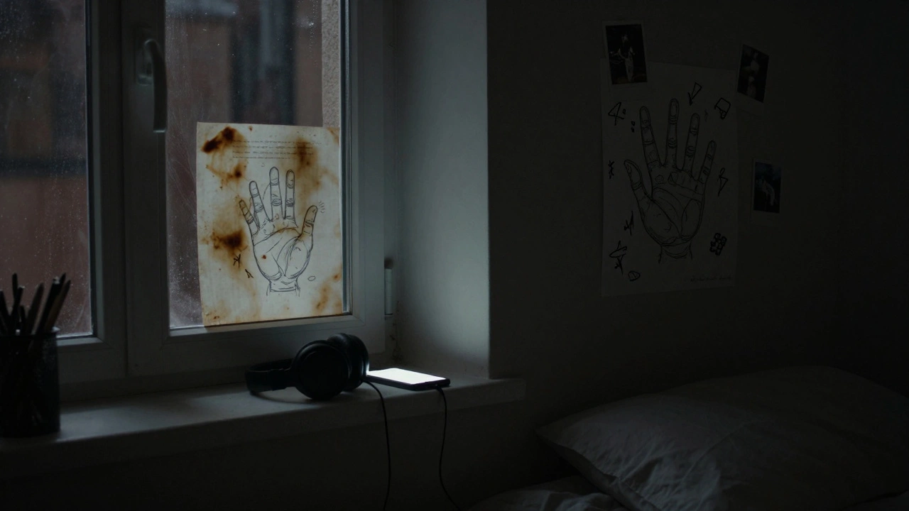
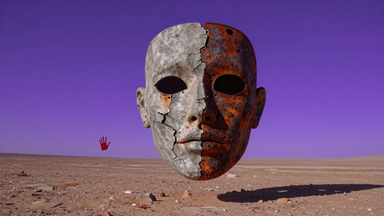
Album artwork isn’t about winning design awards. It’s about being remembered. It’s about being the thing someone says: “Oh, that’s the one with the red hand on the wall.” Or “That’s the cover with the floating eyes.”
When your art becomes a symbol-when people can identify your album just by seeing a corner of it-you’ve won.
Don’t make art that looks good. Make art that sticks.
What’s the ideal size for album artwork?
The standard size is 3000x3000 pixels at 300 DPI for high-quality printing and streaming platforms. Most services like Spotify, Apple Music, and YouTube require at least 1400x1400 pixels. Always provide a high-res version so platforms can scale it properly. The artwork should be square and in RGB format, not CMYK.
Can I use stock images for album art?
You can, but only if you have the proper license for commercial use-and even then, it’s risky. Stock images are used thousands of times. If your cover looks like someone else’s, it gets lost. Custom art-even simple sketches-will always stand out more. If you use stock, heavily edit it: add textures, overlay hand-drawn elements, change colors, combine multiple images. Don’t just drop it in as-is.
Should I include the artist name on the cover?
Not always. Many iconic covers don’t include the artist name at all-think of Nirvana’s Bleach or Radiohead’s OK Computer. If the artwork is strong, the name can be added later in the digital metadata. But if the artist is unknown, having the name clearly visible helps with discovery. Balance is key: make sure the name doesn’t overpower the visual.
How do I know if my album art is too busy?
If you can’t look at it for five seconds without your eyes jumping around, it’s too busy. Try squinting at it. Blurry shapes should still form a clear main element. If everything is competing for attention, remove one thing. Then remove another. Less space often means more impact. A good rule: if you can’t describe the cover in three words, it’s probably cluttered.
Do I need to hire a professional designer?
Not necessarily. Many breakthrough album covers were made by artists themselves using basic tools. What matters is intentionality, not software skill. If you have a clear vision and can execute it-even in Procreate or Canva-you can create something powerful. The key is to avoid generic templates and forced trends. Authenticity beats polish every time.