Ever ordered a batch of tour shirts only to find the black ink looks like a muddy grey on a navy tee? Or maybe the fabric is so stiff it feels like wearing a cardboard box? It happens to the best of us. When you're selling merch, you aren't just selling a logo; you're selling a piece of your brand that fans will wear for years. If the quality is off, that connection breaks. Getting your music merchandise print specs right is the difference between a shirt that stays in the rotation and one that becomes a pajama rag.
Quick Wins for Your Merch Order
- Fabric: Go for 100% combed ringspun cotton for a premium feel.
- Inks: Use Plastisol for bold colors or Water-based for a vintage, soft touch.
- Colors: Always use Pantone codes to avoid "close enough" color mistakes.
- Fit: Heavyweight cotton (6oz+) is trending for streetwear-style music merch.
Picking the Right Fabric for the Vibe
The material you choose dictates how the ink sits and how the fan feels. You can't just pick "a t-shirt." You need to decide between the weight and the weave. For most artists, 100% Combed Ringspun Cotton is a high-quality cotton fabric where the fibers are twisted and combed to remove impurities, resulting in a smoother surface. This is your go-to for a retail-ready feel.
If you're aiming for a gym-ready or high-energy tour vibe, look into CVC (Chief Value Cotton), which is a blend of cotton and polyester, usually around 60/40. It’s more durable and resists shrinking better than pure cotton. However, be careful: polyester can sometimes lead to "dye migration," where the fabric's color bleeds into your print, turning a white logo pink on a red shirt.
For those chasing the "vintage band tee" look, Heavyweight Cotton is the current gold standard. We're talking about fabrics in the 6.0 oz to 7.5 oz range. These hold their shape better and give the print a more structured canvas, which is why brands like Fear of God or old-school 90s metal bands used them.
| Fabric Type | Feel | Best Use Case | Durability |
|---|---|---|---|
| Ringspun Cotton | Soft/Smooth | Premium Indie/Pop Merch | Medium |
| CVC Blend | Athletic/Flexible | Tour/Streetwear | High |
| Heavyweight Cotton | Stiff/Boxy | Vintage/Grunge Aesthetic | Very High |
Ink Types: Bold Pop vs. Soft Touch
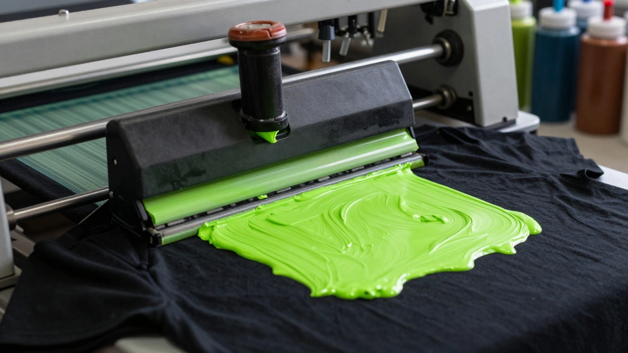
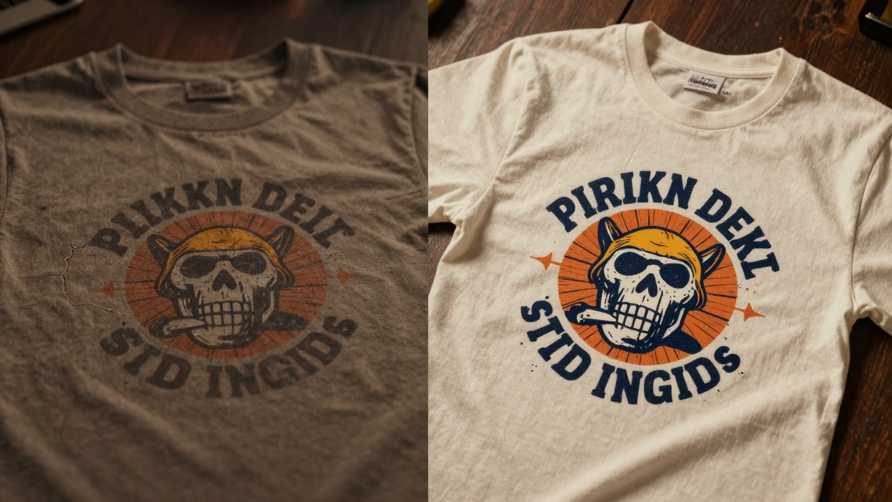
The ink is where the magic (or the mess) happens. You've probably heard of Plastisol Ink, which is a PVC-based ink that sits on top of the fabric rather than soaking into it. It’s the industry standard because the colors are incredibly vibrant and it doesn't fade. If you want a neon green logo to scream against a black shirt, this is your choice. The downside? It can feel like a "plastic sheet" on your chest if the design is too large.
If you want a shirt that feels like the print is part of the fabric, go for Water-Based Ink. This ink soaks into the fibers of the garment. It’s breathable and soft, making it perfect for minimalist designs or artistic, painterly graphics. The trade-off is that the colors aren't as punchy, especially on dark fabrics, where you'll need a "white underbase" (a layer of white ink) to make the colors pop.
Then there's Discharge Printing. This isn't just an ink; it's a chemical process that removes the dye from the shirt and replaces it with a new color. It's the holy grail for black t-shirts because it results in zero "hand feel"-you can't even feel the print with your fingers. It's expensive and requires a specialized shop, but it's how you get those ultra-premium tour shirts.
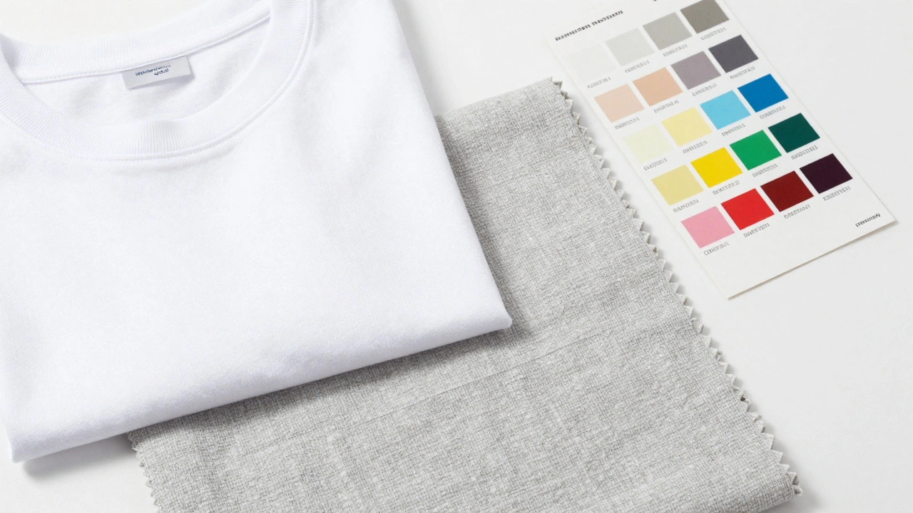
Mastering Color and the Pantone System
Stop telling your printer you want "a nice royal blue." That's a recipe for disaster. What you think is royal blue might be navy to the printer. To get it right, you need to use the Pantone Matching System (PMS), which is a standardized color system that ensures colors are consistent across different printing processes and materials.
When you provide a Pantone code (e.g., Pantone 18-1664 TCX), the printer uses a specific ink mix to hit that exact shade. This is critical for branding. If your album art is a very specific shade of muted sage, and your merch comes back as lime green, your brand identity takes a hit.
Keep a close eye on contrast. A common mistake is putting a dark purple logo on a black shirt. In a dimly lit concert venue, that logo disappears. Use a color wheel to find complementary colors, or stick to high-contrast pairings: white on black, gold on navy, or cream on forest green. If you're doing a multi-color design, remember that every extra color usually adds to the cost because it requires a new screen.
The Technical Side: Vector Art and Halftones
Your printer will ask for "Vector files." If you send a JPG or PNG, they'll probably charge you a fee to fix it or, worse, the print will look blurry. Use Adobe Illustrator to create files in .AI or .EPS format. Vector art is based on mathematical paths, meaning you can scale your logo from a business card to a billboard without losing a single pixel of quality.
If your artwork has gradients-like a sunset or a smoky effect-you'll need Halftones. Since screen printing can't do a "fade" with a single ink, it uses tiny dots of varying sizes to trick the eye into seeing a gradient. The smaller the dots, the smoother the transition. Ask your printer for a "high LPI (Lines Per Inch)" if you want the gradient to look smooth rather than grainy.
Avoiding Common Merch Pitfalls
One of the biggest mistakes is ignoring the "print area." Just because a shirt is XL doesn't mean you can print a design that covers the entire front. Most standard screens are 12"x14". If your art is larger, you'll need "oversized prints," which often cost more and require different equipment.
Another trap is the "neck label." If you're serious about your brand, don't just settle for the manufacturer's tag. Look into Relabeling or "tagless" printing, where your own logo and size info are printed directly onto the inside neck. It's a small detail, but it makes the garment feel like a professional product rather than a generic blank.
Lastly, consider the "cure." If the ink isn't heated to the correct temperature (usually around 320°F for plastisol), it won't bond to the fabric. This leads to the dreaded "cracking" after the first wash. Always ask your printer if they use a conveyor dryer to ensure a full cure.
What is the best fabric for a high-end streetwear music tee?
For a streetwear vibe, go with Heavyweight Cotton (6oz or higher). It provides a structured, boxy fit that is very popular in current fashion trends and handles bold Plastisol prints without sagging.
Why is my white ink looking translucent on a black shirt?
This happens when there isn't a "white underbase." Because black fabric absorbs ink, the printer must lay down a layer of white ink first, cure it, and then print the color on top. Without it, the colors look muted or "soaked in."
Plastisol vs. Water-based: Which is better for tour shirts?
Plastisol is generally better for tours because of its durability and vibrant colors. However, if you want a "vintage" feel and a softer touch that's more breathable in hot venues, water-based ink is the superior choice.
How many colors is too many for a screen print?
Technically, there's no limit, but 3-4 colors is the "sweet spot." Each additional color requires a new screen and more labor, which increases the price per shirt. For complex images with 10+ colors, consider DTG (Direct-to-Garment) printing instead.
What does "combed ringspun" actually mean?
It means the cotton fibers have been combed to remove short, prickly fibers and twists. This results in a much smoother, softer fabric that feels better against the skin and provides a better surface for printing.
Next Steps for Your Order
If you're just starting, order a sample pack. Don't commit to 500 shirts without feeling the fabric and seeing a test print of your logo. If you're on a budget, limit your color palette to 2 colors and use a CVC blend for versatility.
For those scaling up, start building a "spec sheet" for every design. Document the Pantone codes, the fabric weight, and the ink type. This ensures that when you need a reprint in six months, the new batch matches the old one perfectly, keeping your fans happy and your brand consistent.