
Shipping code is easy. Knowing if it actually helped is where most teams get stuck. You launch v2.1, then v2.2, and maybe a hotfix for v2.1.5. Six months later, you’re asked, "Did the new checkout flow reduce churn?" If your answer requires digging through five different dashboards and guessing based on vibes, you don’t have a release analytics system. You have a hope-based development process.
Analyzing multiple releases isn't just about comparing two versions side-by-side. It’s about building a narrative that connects technical changes to business outcomes. Whether you are a product manager trying to justify a roadmap or an engineer debugging a performance regression, the goal is the same: clarity. This guide breaks down how to structure your data, what metrics actually matter, and how to avoid the common traps that make release comparisons useless.
Why Simple A/B Testing Fails for Release Analysis
Many teams default to A/B testing every release. While great for feature flags, this approach falls apart when analyzing full software releases. Why? Because releases often contain dozens of changes. If you compare Version A against Version B, and Version B has 40 new commits, which one caused the 5% drop in page load time? The A/B test tells you the result, but not the cause.
Release analysis requires a different lens. Instead of isolating single variables, you look at the holistic impact of a specific bundle of changes over time. Think of it like medical trials. You aren't testing one pill; you're testing a new treatment protocol that includes diet, exercise, and medication. You need to track the patient's overall health trajectory, not just their reaction to one ingredient.
- Scope: A/B tests isolate features; release analysis evaluates bundles of changes.
- Timeframe: A/B tests run for days/weeks; release analysis tracks trends over months.
- Goal: A/B tests optimize conversion; release analysis ensures stability and long-term value.
The Core Metrics That Matter
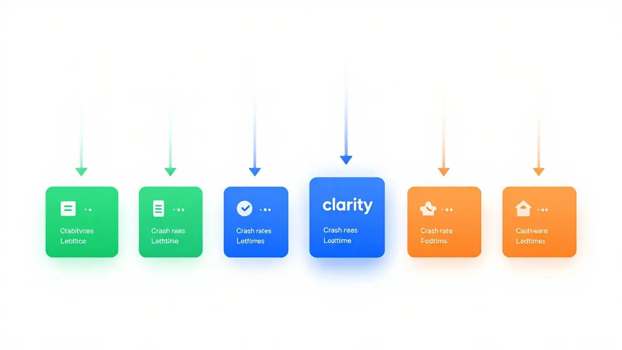
You can’t analyze everything. If you track 50 metrics per release, you’ll drown in noise. Focus on three categories: Stability, Performance, and Adoption. These form the backbone of any credible release comparison.
| Category | Metric | Why It Matters | Common Pitfall |
|---|---|---|---|
| Stability | Crash Rate (per 1,000 sessions) | Directly impacts user trust and retention | Ignoring OS-specific variations |
| Performance | P95 Load Time | Captures the worst-case experience, not the average | Averaging out outliers hides real problems |
| Adoption | Feature Usage Rate | Confirms users are actually engaging with new capabilities | Counting clicks instead of completed actions |
| Business | Churn Rate | The ultimate indicator of product health | Correlating without controlling for seasonality |
Note the emphasis on P95 (95th percentile) rather than average load times. The average might be 1.2 seconds, but if 10% of your users wait 5 seconds, they will leave. Release comparisons must highlight these tail-end experiences because they drive support tickets and negative reviews.
Structuring Your Data for Longitudinal Tracking
To compare Release 1.0 against Release 2.0 effectively, you need consistent data collection from day one. If you change your event naming conventions or sampling rates between versions, your data becomes garbage.
Here is a practical framework for structuring your release data:
- Define the Cohort: Group users by the first version they installed or the date they upgraded. Don't mix users who stayed on v1.0 with those who jumped to v2.0 immediately.
- Normalize the Baseline: Before launching v2.0, establish a 30-day baseline for all key metrics in v1.0. This gives you a control group that isn't affected by the new release.
- Tag Every Commit: Ensure your CI/CD pipeline tags builds with unique identifiers. This allows you to trace specific bugs back to specific code changes later.
Without cohorting, you suffer from survivorship bias. Users who stay on older versions are often more loyal or less tech-savvy. Comparing them directly to early adopters of the new version skews the results. Always segment by upgrade timing.

Identifying Regressions vs. Improvements
Not every metric change is significant. A 0.5% increase in crash rate might be statistical noise. A 2% decrease in sign-up completion rate might be a critical bug. How do you tell the difference?
Use confidence intervals. When comparing two releases, calculate the probability that the observed difference is due to random chance. If the p-value is below 0.05, you can be reasonably confident the change is real. But numbers alone don't tell the story. Context is king.
Consider this scenario: You release v3.0 with a redesigned dashboard. Page views go up by 15%, but time-on-page drops by 20%. Is this good or bad?
- If the goal was efficiency: Good. Users found what they needed faster.
- If the goal was engagement: Bad. Users got bored and left.
This is why you must define success criteria before the release. If you decide after the fact whether the drop in time-on-page is good, you’re just rationalizing your decision.
Tools and Workflows for Automated Comparison
Manual spreadsheet work doesn't scale. As your release frequency increases (think weekly or daily deployments), you need automated reports. Tools like Amplitude is a digital analytics platform that helps track user behavior across web and mobile apps or Mixpanel is a product analytics tool focused on event-based tracking and funnel analysis allow you to set up alerts when specific metrics deviate from historical norms.
However, no off-the-shelf tool captures your specific business logic. You likely need a custom dashboard that pulls from:
- Application Performance Monitoring (APM) tools for latency and errors.
- Product analytics platforms for user behavior.
- Customer Support ticketing systems for qualitative feedback.
The magic happens when you overlay these data sources. For example, if your APM shows increased API latency during v4.0, and your support tool shows a spike in "slow loading" tickets, you have a confirmed regression. If the latency is high but support tickets remain flat, the issue might be invisible to users-or they’ve learned to tolerate it.
Common Pitfalls in Multi-Release Analysis
Even with good tools, humans make mistakes. Here are the three most common errors I see in release post-mortems.
1. Ignoring Seasonality. If you compare Q4 releases to Q1 releases, you’re fighting against holiday traffic spikes and post-holiday slowdowns. Always compare year-over-year or use a moving average to smooth out seasonal noise.
2. Confusing Correlation with Causation. You released a new marketing campaign and a new app version simultaneously. Sign-ups doubled. Was it the app? The ads? Probably both. To isolate the app’s impact, you need a control group that received the new version but no ad spend boost.
3. Overlooking Edge Cases. Metrics usually reflect the majority. But sometimes, a release breaks things for a small subset of users-say, those using legacy devices or specific regional networks. If your sampling only covers top-tier hardware, you’ll miss these regressions until they become PR disasters.
Building a Culture of Continuous Evaluation
Release analysis shouldn’t be a one-time post-mortem. It should be a continuous loop. Every release should inform the next. Create a simple scorecard for each major version. Assign a grade (A-F) based on predefined thresholds for stability, performance, and adoption.
Share these scores openly. When engineers see that v2.3 got a 'B' because of minor performance dips, they take ownership of fixing it in v2.4. When product managers see that a highly anticipated feature had low adoption, they adjust their roadmap accordingly. Transparency turns data into action.
Ultimately, the best release comparison is the one that leads to better decisions. Not just for the next sprint, but for the long-term health of the product. If your data doesn’t change how you build, you’re collecting it for the wrong reasons.
How often should we compare releases?
For major versions (e.g., 1.0 to 2.0), perform a deep dive within two weeks of launch. For minor updates or patches, a monthly review is sufficient. Daily monitoring should focus on critical stability metrics like crash rates, while deeper behavioral analysis can happen on a slower cadence.
What is the difference between release analytics and A/B testing?
A/B testing isolates specific variables to measure their direct impact on a single metric, usually conversion. Release analytics looks at the holistic effect of a bundle of changes on overall product health, including stability, performance, and long-term retention. A/B tests are tactical; release analytics is strategic.
Which metric is most important for release success?
There is no single "most important" metric. However, Crash Rate is the non-negotiable baseline. If a release crashes frequently, other improvements are moot. After stability, prioritize the metric that aligns with your current business goal-whether that is Churn Rate for retention-focused products or Feature Adoption for growth-focused products.
How do we handle users who skip multiple versions?
Create separate cohorts for "Direct Upgraders" (v1.0 to v2.0) and "Skipper Upgraders" (v1.0 to v3.0). Skippers often have different behaviors and tolerance levels. Analyzing them together dilutes the signal. If a feature works well for direct upgraders but fails for skippers, you may need to improve onboarding or backward compatibility.
Can we automate release comparison reports?
Yes, and you should. Use scripting languages like Python or SQL to pull data from your analytics warehouses and generate PDF or Slack summaries automatically. Set up alerts for threshold breaches so your team knows immediately if a release causes a regression, rather than discovering it weeks later in a manual report.