You’ve got the tracks. You’ve got the fans. But if your merch looks like a clip-art experiment from 2005, you’re leaving money on the table. It’s not just about slapping a logo on a cotton blend; it’s about translating your sonic identity into something people want to wear or hang on their wall. Whether you are an indie artist self-releasing an EP or a band looking to boost tour revenue, the visual language of your merch design matters as much as the bassline.
Here is the hard truth: most musicians fail at merch because they treat it as an afterthought. They wait until the night before the release date to send a low-res JPEG to a printer. Then they wonder why sales are flat. The difference between a t-shirt that collects dust in a drawer and one that becomes a conversation starter lies in specific, actionable design choices. Let’s break down exactly how to nail the look for tees, hoodies, and album covers without needing a degree in fine arts.
Why Your Merch Needs to Pass the "Bar Test"
Before we talk pixels and Pantone colors, let’s talk context. Imagine someone wearing your hoodie in a crowded bar. Can they read the text? Does the design look intentional or accidental? This is what designers call legibility and impact. If a fan has to squint to see who the band is, you’ve lost them.
Music merch isn’t just advertising; it’s tribal signaling. Fans wear bands to say, "I was there," or "This sound defines me." If the design is cluttered, that signal gets noisy. Keep it simple. A strong silhouette often beats a detailed illustration. Think about the iconic Rolling Stones tongue or the Nirvana smiley face. They aren’t complex. They are memorable. When designing for apparel, ask yourself: would I wear this if I didn’t know who the band was? If the answer is no, simplify the graphics.
T-Shirts: The Canvas for Bold Statements
The t-shirt is the entry-level product for most fans. It’s affordable, easy to ship, and universally wearable. But it’s also the most competitive space. To stand out, you need to understand the limitations of the medium. Most standard t-shirts are printed using screen printing or Direct-to-Garment (DTG) methods. Each has its quirks.
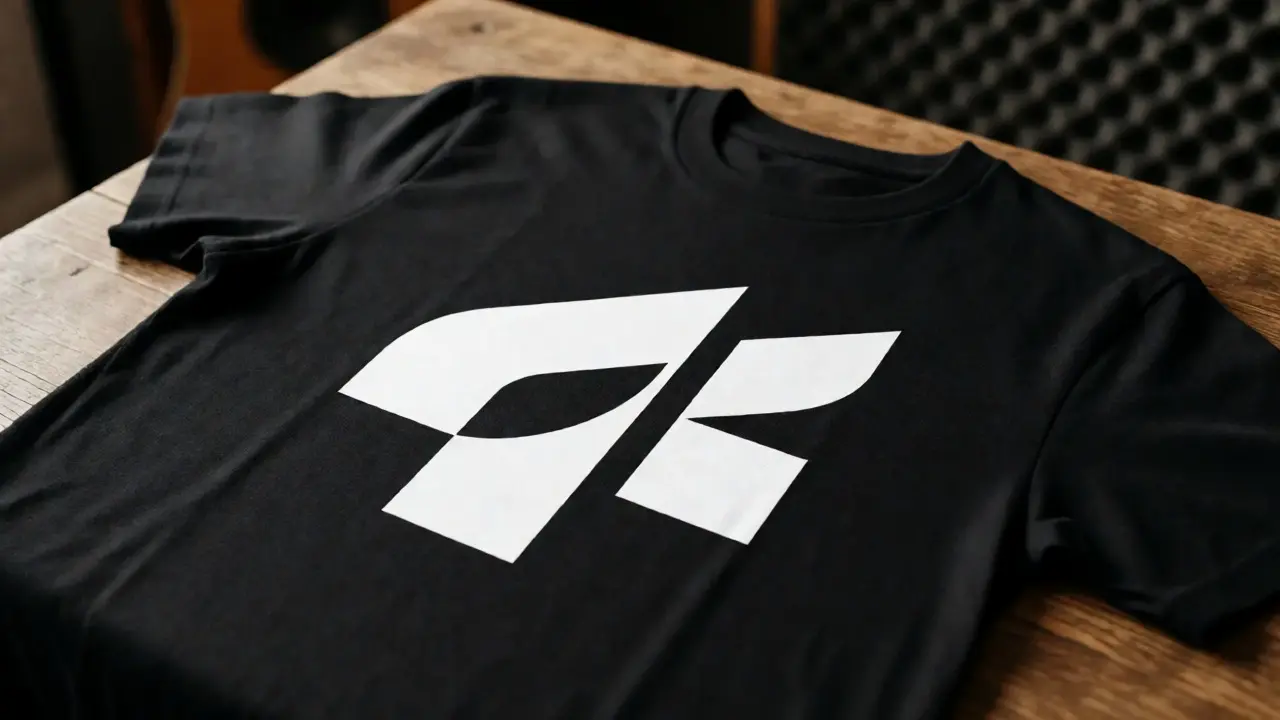
For screen printing, fewer colors mean lower costs and usually better durability. A two-color design in black and white on a black shirt can look incredibly premium. Avoid gradients unless you are paying extra for specialized techniques, as they often band or look muddy on fabric. For DTG, which allows full-color prints, keep in mind that ink soaks into the fabric. Dark shirts require a white underbase, which can make the print feel stiff if overused.
Placement matters more than you think. Center-chest designs are classic but can get hidden by jackets or bags. Pocket prints are subtle and stylish, appealing to fans who prefer understated fashion. Back prints allow for larger artwork, perfect for tour dates or lyric snippets. Remember, the fabric color changes everything. A neon green logo might pop on black but disappear on navy blue. Always mock up your design on the actual shirt color you plan to sell.
Hoodies: Where Comfort Meets Branding
Hoodies are the high-ticket item. People pay $40-$60 for them, so they expect quality. Unlike t-shirts, hoodies offer more surface area and structural elements like the front pocket and the hood itself. These features change how you should approach design.
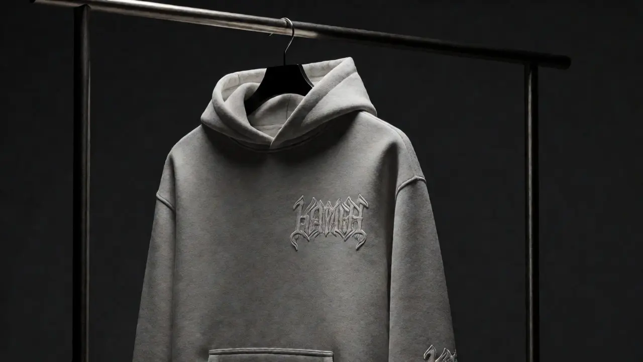
First, consider the seam placement. Heavy embroidery across the chest can be uncomfortable against the skin. Instead, place embroidered logos on the left chest or the sleeve cuff. Embroidery adds texture and perceived value, making the hoodie feel like a piece of gear rather than just clothing. For screen-printed designs on hoodies, avoid placing heavy ink directly over the kangaroo pocket opening, as it can crack when the wearer puts their hands in their pockets.
Color contrast is critical here. Hoodies are often worn in colder months, meaning darker fabrics like charcoal, heather grey, and black dominate. Light-colored inks work best on these backgrounds. If you insist on dark ink on a dark hoodie, use metallics or puff print to create depth. Puff print raises the ink off the fabric, creating a tactile experience that feels expensive. Just don’t overdo it-large areas of puff print can feel rubbery and hot.
Album Art: The First Impression That Lasts
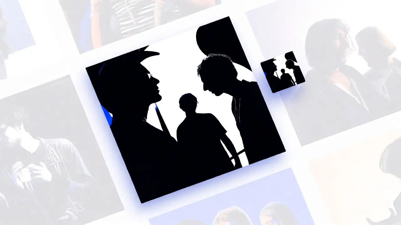
If your merch is the handshake, your album art is the eye contact. In the streaming era, your cover art is often seen at thumbnail size on Spotify or Apple Music. If it doesn’t read clearly at 100x100 pixels, it fails.
Stop trying to cram every member’s face onto the cover. Unless you are a legacy act with massive name recognition, faces often compete with the title. Use typography hierarchy wisely. The band name should be distinct from the album title. Often, the band name goes top-left or bottom-right, while the album title takes center stage. Or vice versa. Pick one dominant element.
Test your art in grayscale. If the composition falls apart when you remove the color, it’s too reliant on hue rather than shape and contrast. Strong silhouettes survive small sizes. Look at successful covers like Pink Floyd’s The Dark Side of the Moon. It’s a prism and light beams. Simple. Iconic. Instantly recognizable even as a favicon in a browser tab.
Technical Specs: Resolutions, Colors, and Files
Nothing kills a print run faster than a pixelated file. Here are the non-negotiables for sending files to printers:
- Resolution: Always design at 300 DPI (dots per inch). If you design at 72 DPI (screen resolution), your print will look blurry. Work at the actual print size. If the shirt needs a 12-inch wide print, set your canvas to 12 inches wide at 300 DPI.
- Color Mode: Screens use RGB (Red, Green, Blue). Printers use CMYK (Cyan, Magenta, Yellow, Black). Convert your files to CMYK before exporting. Some bright RGB colors (like electric lime or hot pink) cannot be reproduced in CMYK. You’ll need to adjust them manually to ensure they don’t turn dull brownish-green.
- File Format: Send vector files (AI, EPS, PDF) whenever possible. Vectors scale infinitely without losing quality. If you must use raster images (PNG, TIFF), ensure they are flattened and have transparent backgrounds (for PNGs) unless you want a white box behind your logo.
- Bleed Area: Extend your background color beyond the trim line by 0.125 inches. This ensures no white edges appear if the cut is slightly off-center during manufacturing.
Comparing Apparel Types for Maximum Impact
Not every design works on every garment. Here is a quick guide to matching your visual strategy with the right product.
| Garment Type | Best Design Style | Recommended Placement | Common Pitfall |
|---|---|---|---|
| T-Shirt | Bold graphics, minimal text, high contrast | Center chest, back yoke | Design getting covered by hair or bags |
| Hoodie | Embroidery, puff print, textured layers | Left chest, sleeve, upper back | Ink cracking over pocket seams |
| Vinyl Record Sleeve | High-detail art, matte finish, spot UV | Full front/back wrap | Text too small to read on phone screens |
Building a Cohesive Visual Identity
Your t-shirt, hoodie, and album cover should feel like siblings, not strangers. This doesn’t mean using the exact same image everywhere. It means sharing a DNA. Maybe it’s a specific font pairing, a recurring symbol, or a strict color palette.
Create a brand kit. Define three primary colors and two secondary accents. Choose one bold sans-serif font for headlines and one clean serif or mono-spaced font for details. Stick to these rules across all platforms. When a fan sees a new single cover, they should instantly recognize it as yours, even without seeing the logo. Consistency builds trust. Trust drives repeat purchases.
Consider the lifecycle of your visuals. An album cycle lasts 12-18 months. Don’t burn out your best imagery on a single tee. Save your strongest iconography for limited edition drops. Use variations of your main logo for everyday basics. This creates a sense of scarcity and exclusivity, encouraging fans to buy now rather than later.
Final Checklist Before You Hit Print
Before you upload those final files, run through this mental checklist:
- Did I check the contrast against the darkest and lightest shirt options?
- Is the file vector-based or at least 300 DPI?
- Have I converted colors to CMYK?
- Does the design look good in a tiny thumbnail view?
- Would I wear this myself if I saw a stranger in it?
Good design isn’t magic. It’s empathy. It’s understanding how people consume music and how they express themselves through what they wear. Get the technical specs right, keep the visuals bold, and stay consistent. Your fans will thank you with their wallets.
What is the best file format for t-shirt printing?
Vector formats like AI, EPS, or PDF are ideal because they scale without losing quality. If you must use raster images, high-resolution PNGs with transparent backgrounds are the next best option. Always ensure the resolution is at least 300 DPI at the actual print size.
How many colors should I use in my merch design?
For screen printing, fewer colors (1-3) reduce setup costs and production time. For digital printing (DTG), you can use unlimited colors, but keeping the design simple often yields a cleaner, more professional look. Complex gradients can sometimes look muddy on fabric.
Should I put my entire band photo on the album cover?
Not necessarily. Unless you have massive name recognition, photos can clutter the design and make it hard to read at small sizes. Abstract art, typography, or symbolic imagery often stands out better in streaming service thumbnails. Test your cover at 100x100 pixels to see if it remains legible.
What is the difference between RGB and CMYK?
RGB is for screens (light-based) and offers a wider range of bright colors. CMYK is for printing (ink-based) and has a smaller color gamut. Bright blues and greens in RGB may appear duller in CMYK. Always convert your designs to CMYK before sending them to a printer to avoid unexpected color shifts.
Where is the best place to put a logo on a hoodie?
The left chest is the standard location for logos, offering visibility without overwhelming the garment. Sleeve placements are great for subtle branding. Avoid placing large prints directly over the front pocket, as movement can cause the ink to crack over time.