Imagine sending out a beautiful, vibrant newsletter about your latest album drop. Your subscribers open it on their phones at night, and suddenly, the bright white background burns their eyes. The black text disappears into the dark background. This is the reality of dark mode in 2026. With over 70% of smartphone users enabling dark themes to save battery and reduce eye strain, ignoring this preference means losing half your audience before they even read the first line.
For music newsletters, where visual identity is everything, this challenge is particularly tricky. You want bold colors, high-contrast artwork, and dynamic layouts. But you also need readability. Here is how to design emails that look stunning in both light and dark modes without doubling your workload.
Why Dark Mode Matters More Than Ever
It’s not just a trend; it’s a user expectation. According to recent usability studies, users who switch to dark mode report a 40% reduction in perceived eye fatigue during evening reading sessions. For a music fan scrolling through tour dates or listening to new tracks at 10 PM, this matters. If your email forces them to squint, they’ll swipe away.
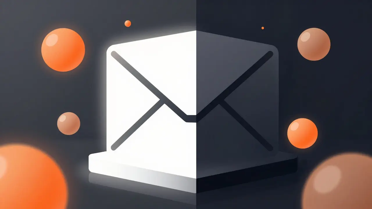
The core issue lies in color contrast. In light mode, we are used to dark text on a light background. In dark mode, it flips: light text on a dark background. Many email clients automatically invert colors if you don’t specify otherwise. This leads to the infamous "white box" problem, where your carefully designed colored sections turn blindingly white against the user's dark interface.
The Core Principles of Dual-Mode Design
You don’t need two separate templates. Instead, you need a flexible system that adapts. Think of it like designing a stage set that works under both spotlight and ambient lighting. The structure stays the same, but the materials reflect the environment differently.
- Use System Colors: Rely on CSS variables or media queries where supported by major clients like Apple Mail and Gmail. This allows the background to match the user’s system preference automatically.
- Avoid Pure Black (#000000): Pure black can cause "smearing" effects on OLED screens. Use a very dark gray, such as #121212 or #1E1E1E, for backgrounds. It looks softer and more professional.
- Adjust Text Contrast: Light text on dark backgrounds needs slightly less brightness than dark text on light backgrounds. Aim for a contrast ratio of at least 4.5:1 for body text, but test with 7:1 for smaller fonts.
Handling Images and Album Artwork
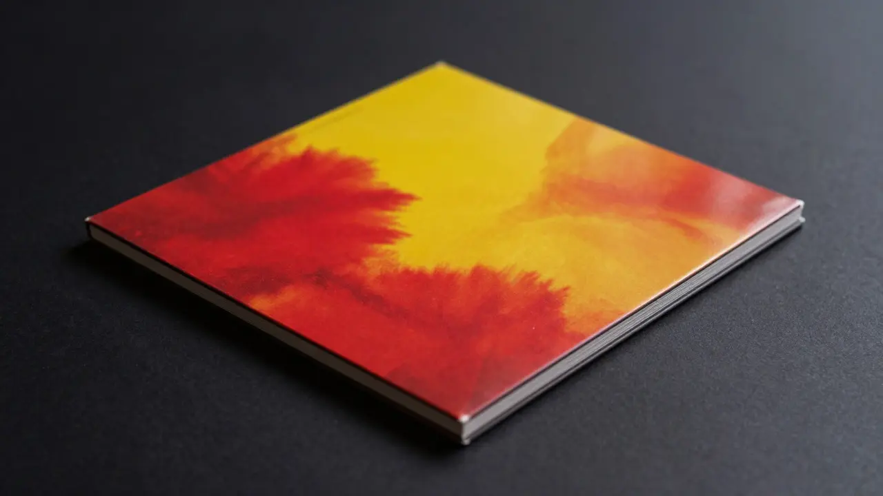
This is where music newsletters often fail. Album covers are usually bright and colorful. Placing a vibrant, high-key image directly on a dark background can create a jarring visual vibration, known as "halo effect." Your eyes struggle to focus on the details because of the extreme luminance difference.
Here is a simple fix: add a subtle border or padding around images. A 1-pixel border in a mid-tone gray (like #333333) acts as a buffer zone. Alternatively, place images inside a container with a slightly lighter dark background than the rest of the email. This frames the artwork and reduces the shock to the viewer’s eyes.
Typography That Works in Both Worlds
Font choice impacts readability significantly in low-light conditions. Thin font weights (like Light or Extra Light) tend to disappear in dark mode because they lack enough pixel density to stand out against the dark background. Stick to Regular or Medium weights for body text.
Also, consider your line height. In dark mode, lines of text can blur together due to the way our eyes process light on dark surfaces. Increase your line-height from 1.5 to 1.6 or 1.7. This extra breathing room helps readers track lines without losing their place, which is crucial when listing multiple songs or tour dates.
Testing Across Devices and Clients
Email rendering is notoriously inconsistent. What looks perfect in Apple Mail might break in Outlook. To ensure your dark mode strategy holds up, follow this testing routine:
- Apple Mail (iOS/macOS): The gold standard for dark mode support. Test here first.
- Gmail (Android/iOS/Web): Supports dark mode well but handles images differently. Check if your album art retains its aspect ratio.
- Outlook (Windows/Mac): Historically poor at supporting modern CSS, including dark mode media queries. You may need a fallback plan, such as forcing a light background for Outlook users via conditional comments.
- Third-party Preview Tools: Use services like Litmus or Email on Acid to see how your email renders across dozens of devices simultaneously.
Don’t forget to test with actual users. Send a beta version to five friends who use dark mode exclusively. Ask them one question: "Did any part of the email feel hard to read?" Their feedback will catch issues your designer might miss.
Common Pitfalls to Avoid
Even experienced marketers make these mistakes. Watch out for:
- Hard-coded White Backgrounds: If you set the body background to #FFFFFF, it will stay white in dark mode, creating a glaring rectangle. Use 'transparent' or system-dependent colors instead.
- Low-Contrast Accent Colors: Pastel colors that work beautifully on white can become invisible on dark gray. Boost the saturation or brightness of your accent colors specifically for the dark variant.
- Ignoring Link Underlines: In dark mode, links without underlines are harder to distinguish from regular text. Always keep underlines on links, or use a distinct color change on hover (if supported).
Next Steps for Your Next Campaign
Start small. Take your last successful newsletter and apply the dark mode adjustments outlined above. Change the background to #121212, adjust the text to #E0E0E0, and add borders to your images. Send it to a small segment of your list and monitor your click-through rate and bounce rate compared to previous campaigns. You’ll likely see a noticeable improvement in engagement, especially among mobile users. Once you have a solid template, build your entire library of music content around it. Consistency builds trust, and a comfortable reading experience keeps fans coming back for every new release.
Does every email client support dark mode?
No. Major clients like Apple Mail, Gmail, and Yahoo Mail support it well. Outlook on Windows has limited support, so you may need a fallback design for those users. Always test across platforms.
Should I send two different versions of my email?
Usually, no. Modern CSS techniques allow a single HTML file to adapt to both modes. Sending two versions doubles your load time and complexity. Only consider separate versions if your design relies heavily on complex graphics that cannot be adapted.
What is the best background color for dark mode emails?
Avoid pure black (#000000). Use a very dark gray like #121212 or #1E1E1E. These colors reduce eye strain and prevent smearing effects on OLED screens while maintaining a true dark aesthetic.
How do I handle bright album cover art in dark mode?
Add a subtle border or padding around images. A 1-pixel border in a mid-tone gray (e.g., #333333) creates a buffer between the bright image and the dark background, reducing visual vibration and improving focus.
Will dark mode affect my email open rates?
Indirectly, yes. Poorly designed dark mode emails lead to higher bounce rates and lower engagement, which can hurt your sender reputation over time. Optimizing for dark mode improves user experience, leading to better long-term deliverability and engagement metrics.