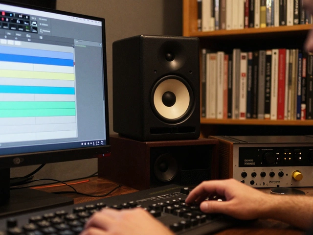
Ever watched a music video and felt an immediate emotional pull before the first lyric even hit your ears? That’s not magic; it’s color grading working its silent influence on your subconscious. When we look at Robert Hill's recent work, specifically his latest visual releases from early 2026, we see a masterclass in using hue, saturation, and luminance to dictate mood rather than just decorate the screen.
You might think color is just about making things look "pretty." But for directors like Hill, it’s a narrative tool. If you’re trying to understand how these choices shape the viewer experience, or if you’re an editor looking for inspiration, this breakdown cuts through the jargon. We aren't talking about abstract art theory here. We are looking at specific decisions-why that teal shadow against an orange highlight works, or why desaturating the background forces you to focus on the artist’s face.
The Shift Toward Muted Realism
A few years ago, the trend in high-budget music videos was hyper-saturation. Everything popped. Colors were neon-bright, almost cartoonish. Robert Hill’s recent trajectory flips this script. His latest projects lean heavily into what cinematographers call "muted realism." This doesn’t mean boring. It means restraint.
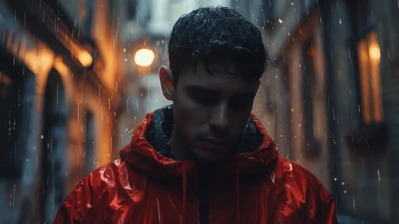
Take his video for "Echoes in the Rain," released last month. The entire piece operates within a narrow color palette of slate grays, deep blues, and warm ambers. By limiting the range of colors, Hill ensures that when a bright red jacket appears, it screams for attention. This technique relies on selective saturation. Instead of boosting all colors equally, he isolates specific hues to guide the eye. It’s a subtle trick, but it keeps the viewer engaged without overwhelming them with visual noise.
Why does this matter? Because modern audiences scroll fast. If your video looks like every other saturated clip on TikTok, they swipe away. Muted tones feel more cinematic, more expensive, and frankly, more trustworthy. They signal that the creator made deliberate choices, not just applied a preset filter.
Contrast as a Narrative Device
Color isn’t just about hue; it’s about light. In Hill’s work, contrast plays a pivotal role in storytelling. Look at the transition scenes in his acoustic series. He often uses low-key lighting, where shadows dominate the frame. This creates intimacy. You feel like you’re in the room with him, not watching a performance on a stage.
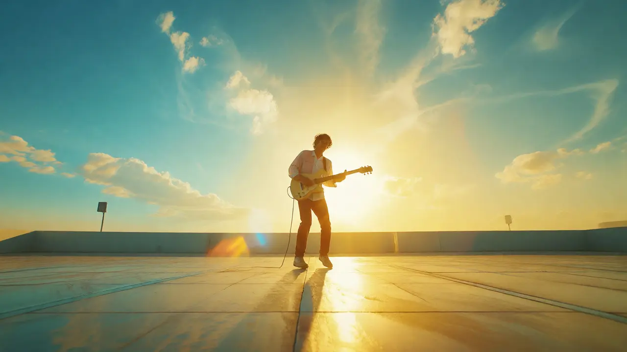
Conversely, his upbeat tracks utilize high-key lighting with minimal shadows. The whites are crisp, the highlights are blown out slightly to create a dreamy, ethereal vibe. This shift in contrast mirrors the energy of the track. You don’t need to hear the beat drop to know the mood has changed; your eyes tell you because the shadows vanished.
| Video Title | Dominant Palette | Contrast Level | Emotional Impact |
|---|---|---|---|
| Echoes in the Rain | Cool Blues & Ambers | Medium-High | Melancholy, Introspective |
| Sunlight Drive | Warm Yellows & Teals | Low (High-Key) | Optimistic, Energetic |
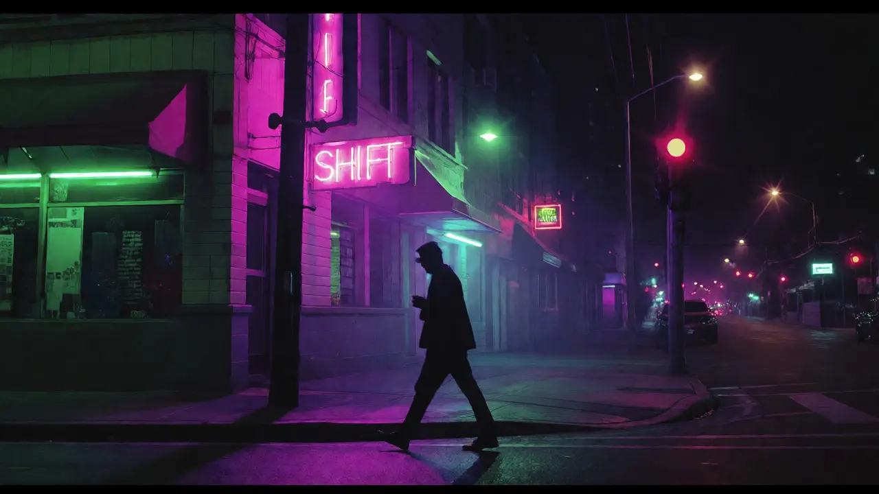
| Night Shift | Neon Greens & Purples | Extreme | Tense, Urban, Modern |
This table highlights how distinct palettes serve different narrative purposes. Notice how "Night Shift" breaks the muted rule. Here, Hill leans into artificial lighting sources-streetlights, club signs-to create a gritty, urban feel. The green tint isn’t accidental; it mimics the harshness of fluorescent office lights or sodium vapor lamps, grounding the fantasy in a recognizable reality.
Texture and Grain: The Analog Touch
Digital cameras capture perfection. Too much perfection can feel sterile. Robert Hill counters this by adding digital grain and texture overlays. This isn’t just nostalgia for film stock. It’s about adding weight to the image. Grain softens edges, blending the subject into the environment rather than having them pop out sharply.
In his behind-the-scenes interviews, Hill mentions using emulation plugins that mimic Kodak Vision3 500T film stock. Why? Because that specific stock renders skin tones with a warmth that digital sensors struggle to replicate naturally. It adds a layer of sophistication that viewers perceive subconsciously. They don’t think, "Ah, that’s Kodak." They just feel that the video looks better, richer, more human.
If you’re editing your own content, try adding a subtle grain layer set to "Overlay" mode at 10-15% opacity. It bridges the gap between the camera and the viewer, creating a tactile connection.
Consistency Across Platforms
Here’s a trap many creators fall into: they grade for the big screen but forget the phone. Most people watch music videos on mobile devices with small screens and varying brightness levels. Hill’s team tests their grades on iPhones, Androids, and tablets before release.
What looks dramatic on a calibrated monitor might look muddy on a dimmed phone screen. To combat this, Hill boosts mid-tone brightness slightly while keeping blacks lifted. This ensures details remain visible in dark scenes without crushing the blacks entirely. It’s a compromise, sure. You lose some dynamic range, but you gain accessibility. And in the social media age, accessibility equals views.
Consider the platform algorithms too. Instagram and TikTok compress video files aggressively. Heavy compression destroys fine color gradients. By sticking to bolder, simpler color blocks rather than subtle gradients, Hill’s videos survive compression better. They retain their impact even after being uploaded, downloaded, and re-uploaded.
How to Apply These Lessons
You don’t need a Hollywood budget to emulate these techniques. Start by defining your emotional goal. Are you going for sad? Use cool tones and low contrast. Happy? Warm tones and high key. Then, restrict your palette. Pick three colors max. Stick to them.
- Define the Mood: Write down one word that describes the feeling. Let that drive your color choice.
- Limit Your Palette: Choose primary, secondary, and accent colors. Avoid rainbow chaos.
- Test on Mobile: Watch your edit on a phone before exporting. Adjust brightness if details disappear.
- Add Texture: A little grain goes a long way in making digital footage feel organic.
Robert Hill’s success isn’t just about catchy tunes. It’s about respecting the visual medium. He treats color as part of the song, not just packaging for it. Next time you watch his videos, pause and ask yourself: why is this scene blue? Why is that shot so bright? The answers will change how you see every frame.
What software does Robert Hill use for color grading?
While exact workflows vary, industry standards suggest he likely uses DaVinci Resolve for its robust color wheels and node-based system. Many indie directors prefer it over Adobe Premiere Pro for serious grading due to its precision tools.
Why do his videos look so cinematic?
It’s a combination of controlled lighting during shooting and careful post-production grading. He avoids flat lighting, uses practical light sources for depth, and applies film-emulation LUTs to unify the look.
Can I copy his style with a smartphone?
Yes. Apps like VN Editor or CapCut allow basic color correction. Focus on adjusting exposure and saturation manually rather than using heavy filters. Keep the look natural and consistent.
Does color grading affect streaming royalties?
Indirectly, yes. Better visuals lead to higher engagement and longer watch times. Algorithms favor videos with high retention rates, which can boost visibility and play counts.
What is selective saturation?
Selective saturation involves boosting the intensity of specific colors while desaturating others. This draws the viewer’s eye to key elements, such as an artist’s clothing or a prop, without distracting from the overall composition.