It’s 2 AM on release day. Your song just dropped, but you’re staring at a blank screen wondering if anyone is actually listening. You check your phone, see three likes, and panic. Then you check the next one, see zero streams, and start doubting the marketing strategy. This anxiety is real, but it’s usually caused by looking at raw numbers in isolation rather than understanding the story they tell. A well-built KPI dashboard turns that chaotic stream of data into a clear narrative about how your music release is performing.
You don’t need to be a data scientist to build this. You just need to know which metrics matter, where to find them, and how to connect them automatically so you can stop refreshing pages manually. Here is how to move from guessing to knowing.
The Core Metrics That Actually Matter
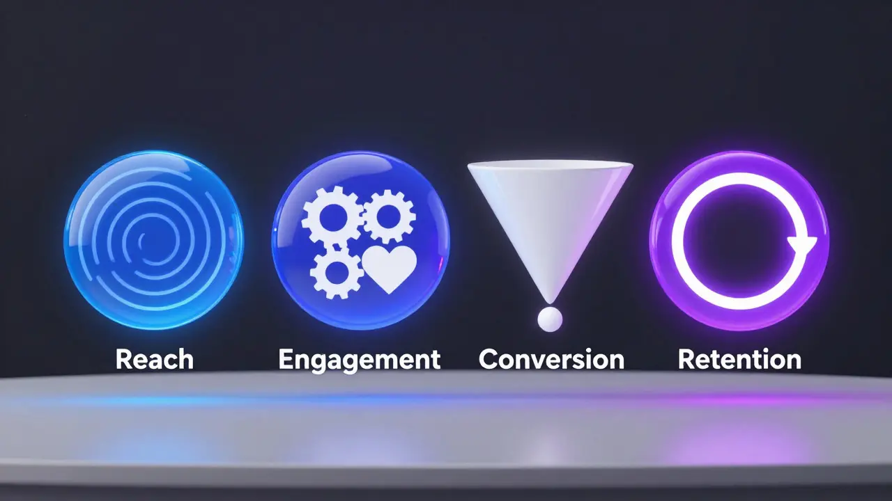
Not every number on your backend is useful. Some are vanity metrics that make you feel good for five seconds before fading away. For a music release, focus on four core categories: reach, engagement, conversion, and retention. Each serves a different purpose in measuring success.
- Reach: Total unique listeners across platforms. This tells you how far the song traveled.
- Engagement: Save rate (saves divided by total plays) and skip rate. High saves indicate fans; high skips indicate a weak hook or mismatched audience.
- Conversion: Percentage of listeners who follow your artist profile after playing the track. This is the most critical metric for long-term growth.
- Retention: Average play duration relative to track length. If people listen to the whole song, you’ve kept their attention.
Why do these matter more than total plays? Because total plays can be inflated by algorithmic pushes that don’t convert to fans. A song with 10,000 plays and a 5% save rate is less valuable than a song with 2,000 plays and a 20% save rate. The latter builds a community; the former just generates noise.
Gathering Data Without Losing Your Mind
The biggest hurdle in building a dashboard isn’t analysis-it’s collection. Most artists get data from at least three sources: Spotify for Artists is the primary platform for streaming analytics in the US and Europe, Apple Music for Artists provides insights into iTunes and Apple ecosystem usage, and DistroKid or similar distributors give you royalty breakdowns. Manually copying these numbers into a spreadsheet every morning is unsustainable.
Instead, use APIs. Both Spotify and Apple Music offer public developer APIs that allow you to pull data programmatically. If you aren’t comfortable coding, look for no-code tools like Zapier or Make.com that can trigger an email or update a Google Sheet whenever new data becomes available. The goal is to have a single source of truth-a central database-where all your platform data lands automatically.
Here is a simple workflow:
- Connect your distributor account to a cloud storage service (like Google Drive).
- Set up an automation rule to download daily CSV exports.
- Use a script or tool to clean and merge these files into a master dataset.
- Visualize that master dataset in a tool like Tableau, Power BI, or even a complex Google Sheets formula.
This setup takes time to build initially, but once running, it requires zero daily effort. You wake up, open your dashboard, and the previous day’s performance is already there.
Building the Visual Dashboard
Once your data is centralized, you need to present it in a way that answers questions quickly. Don’t clutter the screen with every possible chart. Focus on a layout that guides the eye from high-level overview to specific details.
A standard release dashboard should include:
- Top Line KPIs: Big numbers for Total Streams, Unique Listeners, and New Followers gained since release.
- Trend Lines: Daily streams over time. Look for spikes (did a playlist pick drive traffic?) and drops (did the algorithm stop pushing it?).
- Geographic Heatmap: Where are your listeners located? This helps target future ad spend or tour dates.
- Source Breakdown: What percentage of streams come from playlists vs. direct search vs. social media links?
Color coding is your friend here. Use green for positive trends (increasing followers) and red for negative ones (high skip rates). Keep the design clean. If a designer looks at your dashboard and feels overwhelmed, your label or manager definitely will.
Automating Alerts and Reports
Passive dashboards are okay, but active systems are better. Set up alerts for anomalies. For example, if your daily streams drop by more than 30% compared to the previous week’s average, send yourself an email. This could indicate a technical issue with your distribution or a sudden loss of playlist support.
Conversely, set up celebration alerts. If a track enters a major editorial playlist, notify your team immediately so they can push social media content while the momentum is high. Tools like Slack or Discord bots can handle these notifications easily when connected to your data pipeline.
For weekly reports, automate the generation of a PDF summary. Include the key KPIs, a screenshot of the trend line, and a brief note on any significant events (like a radio interview or a feature on a blog). Send this to your management team every Monday morning. Consistency builds trust.

Common Pitfalls to Avoid
Even with a great system, mistakes happen. Here are the most common traps artists fall into:
- Ignoring Time Zones: Spotify data updates at 8 PM Pacific Time. If you compare “today’s” numbers without accounting for this lag, you’ll think your song flopped when it’s just not fully loaded yet.
- Over-Reliance on One Platform: If 90% of your streams come from Spotify, your business is fragile. Track diversity across Apple Music, Amazon Music, and Tidal to ensure stability.
- Vanity Metric Obsession: Stop celebrating total plays. Start celebrating save rates and follower conversions. These predict long-term career health.
- Static Dashboards: A dashboard that doesn’t update automatically is useless. If you have to manually enter data, you won’t keep it up to date. Automation is non-negotiable.
Remember, the goal isn’t to have the prettiest charts. It’s to have the fastest access to actionable insights. If a metric doesn’t change your decision-making process, remove it from the dashboard.
From Data to Decisions
So what do you do with all this information? Let’s say your dashboard shows a high skip rate in the first 15 seconds. What does that mean? It means your intro might be too long, or the audio quality is poor on mobile devices. Action: Edit the intro for future releases or check your mastering settings.
If your geographic heatmap shows strong performance in Portland, Oregon, but weak performance in Los Angeles, maybe it’s time to book a local show in LA or run targeted ads there. The data points to the problem; your creativity solves it.
Building a KPI dashboard for music releases is less about technology and more about discipline. It forces you to define what success looks like before the record drops. It removes emotion from the equation. And it gives you the confidence to sleep through release day, knowing that whatever happens, you’ll know exactly why by morning.
How often should I update my music release dashboard?
Ideally, daily. Streaming platforms like Spotify update their data once per day, usually in the evening Pacific Time. Setting up an automated daily refresh ensures you always have the latest figures without manual work.
What is the most important KPI for a new artist?
Follower conversion rate. While total streams are impressive, converting listeners into followers creates a repeatable audience for future releases. Aim for a conversion rate above 5% to consider a release successful in terms of fanbase growth.
Do I need to code to build an automated dashboard?
No. No-code automation tools like Zapier or Make.com can connect distributor APIs to spreadsheets or visualization tools. However, basic knowledge of API documentation helps troubleshoot issues and customize data fields.
Which platforms should I include in my dashboard?
Start with Spotify, Apple Music, and your primary distributor (like DistroKid or TuneCore). Add Amazon Music and YouTube Music if they represent significant portions of your revenue. Prioritize platforms where you have over 10% of your total streams.
How do I calculate save rate correctly?
Divide the number of times a track was saved to a user’s library by the total number of unique listeners who played it. Note that some platforms count multiple saves by the same user, so using unique listener counts provides a more accurate engagement metric.